
design & art direction
Heinz - Tomato Blood
Mayo Couture
The Community Spirit
True Botanicals
Echo Park
Etcetera
Contact
About
©2023

design & art direction

︎︎︎ Packaging Design
︎︎︎ Brand Marketing Collateral
︎︎︎ Social
Agency: The Rare Form
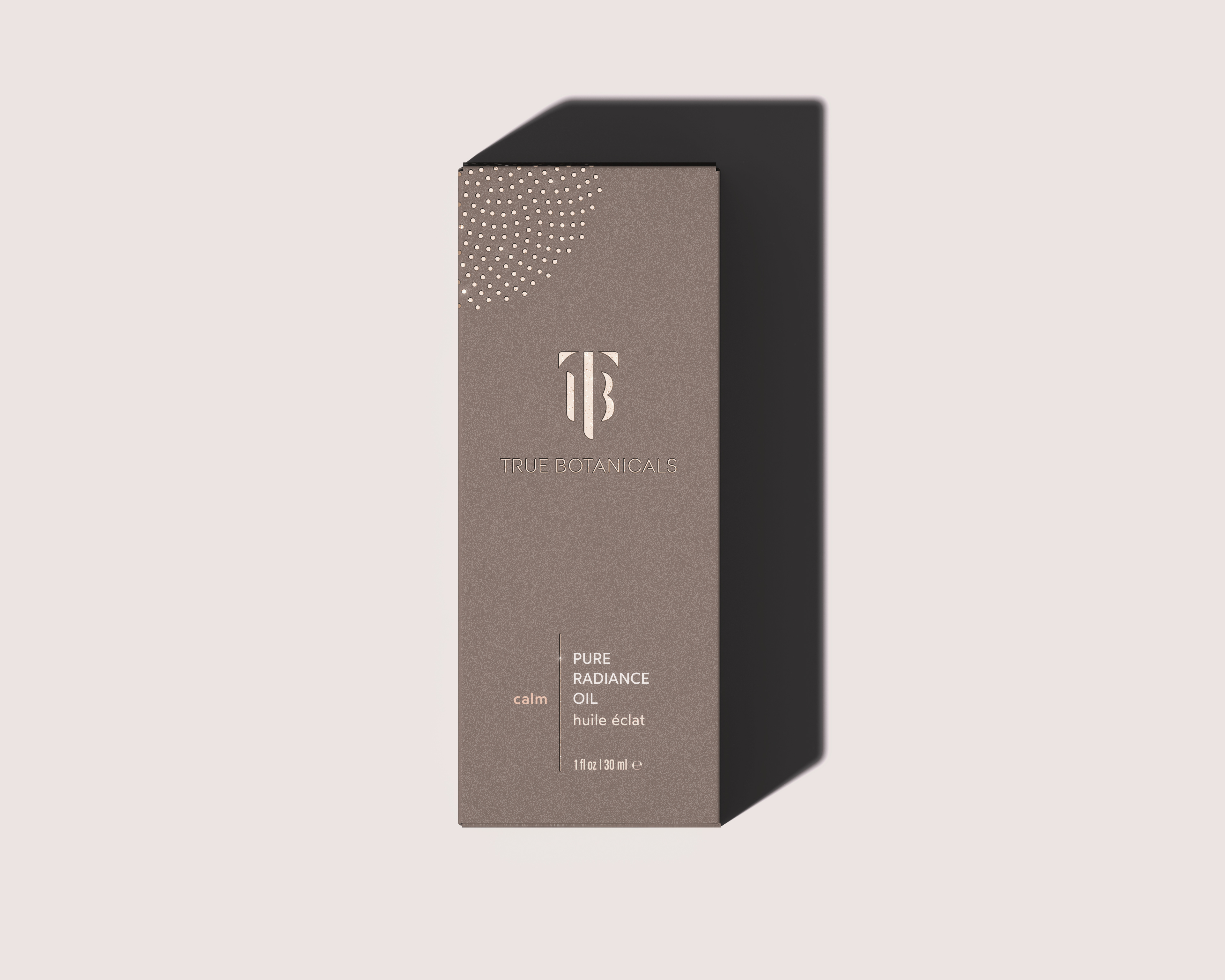
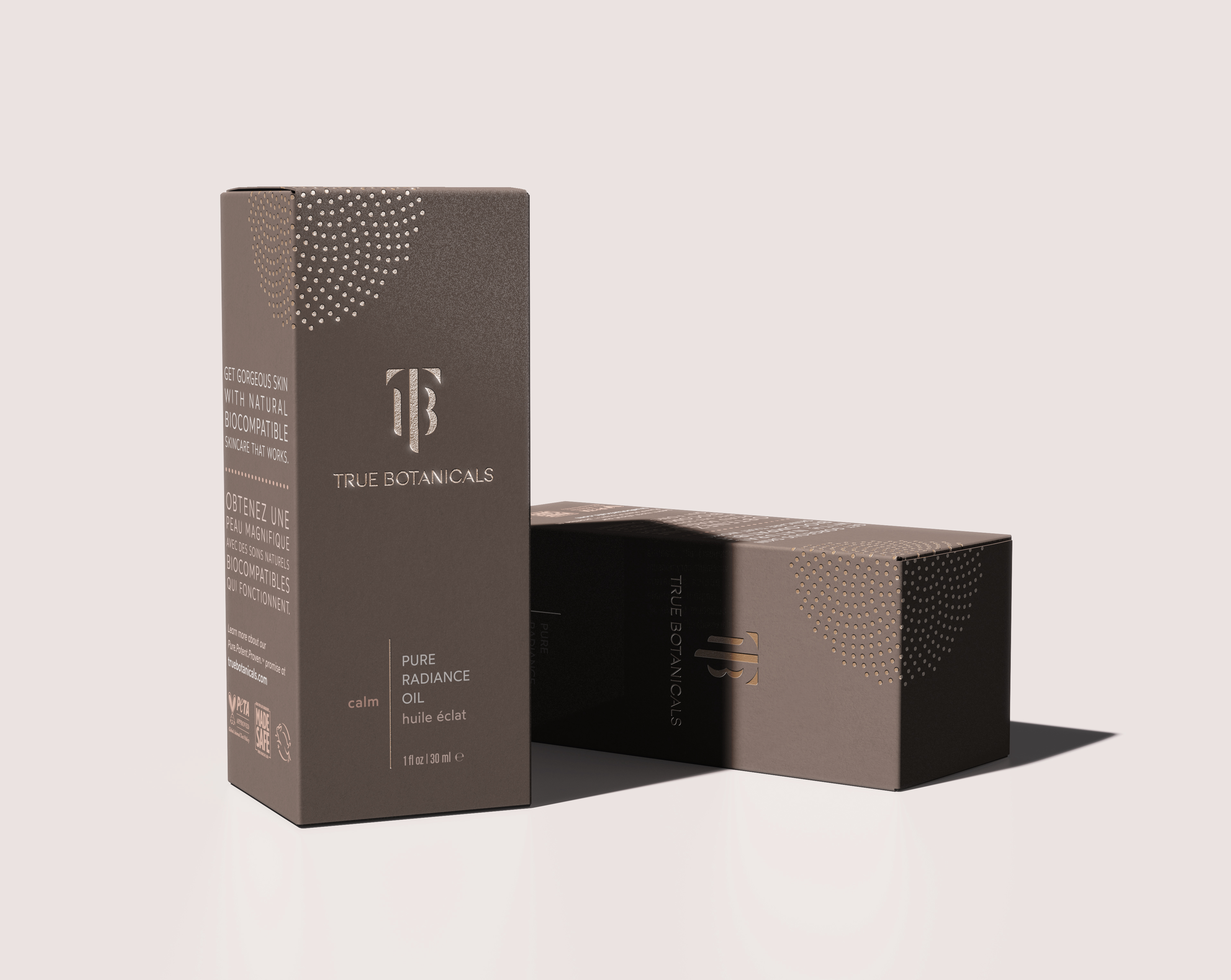
True Botanicals is a clean skincare brand that creates luxurious, natural-biocompatible skincare products designed by women, for women; to practice indulgent self-care.
With my team at The Rare Form, we evolved the brand’s identity and packaging aesthetics to elevate the brand into the luxury space, while retaining the brand’s “Sensual Eco Luxury” DNA.


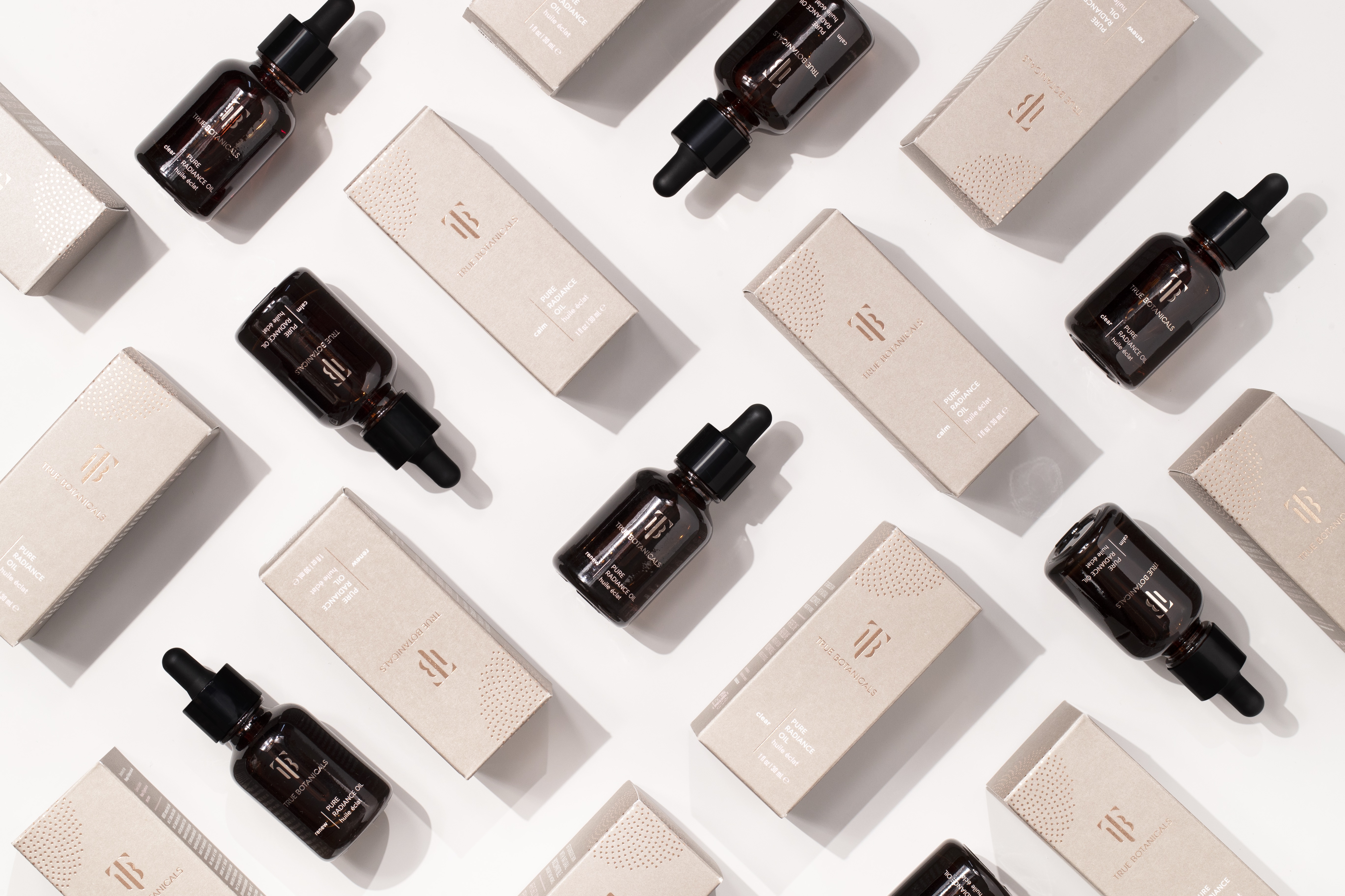
︎︎︎ Visual evolution of the True Botanicals brand.
To revamp their brand from clean, clinical, and conscious to liberated, wild, and sensual, I helped to incorporate and explore the simplified and stylized Fibonacci mark, wordmark and typography within the secondary packaging.
The monogram and wordmark are consistently used across the entire packaging system, along with the brand typography .
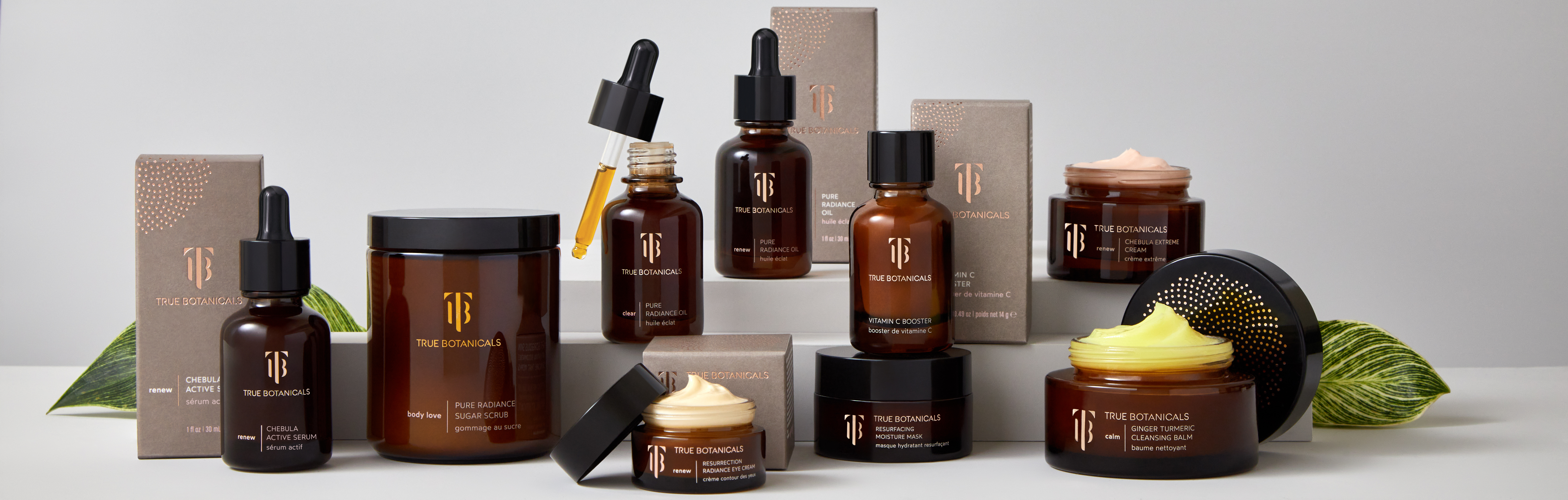


The iconography enforces the clean & green aspects of the products
themselves, with clean line illustrations
and circles.
They also help to emphasize the research that goes into each and every luxury, biocompatible product tailored to treat every skin concern.
🡓 Core iconography for use in emails and website.
![]()
They also help to emphasize the research that goes into each and every luxury, biocompatible product tailored to treat every skin concern.
🡓 Core iconography for use in emails and website.

| 🡐 icons in use for infographics & new skin product education |
I continued to work with TRF to execute a stunning and sensuous set of marketing collateral, launch emails and product education through infographics and iconography.
We also did some creative design for social, and all of the paid social ads, which is always a fun way to solidify the brand identity for them.


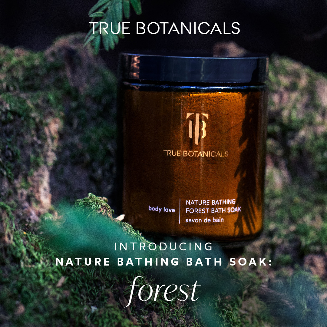


Organic and paid social